Case study · Orita
Design is the stage, content is the performer
Orita’s brand grew up in two years. Research changed what it had to do, every surface got rebuilt on one set of rules, and then I wrote the rules down so a team of non-designers and a machine could hold them without me.
- Role
- Sole designer; contractor, continuous since 2021 and ongoing
- Shipped
- Orita brand refresh, May 2026Slide design skill, May 2026Claude skills workshop, May 2026Org-default Claude design system, July 2026orita.ai/brand, July 2026
- Timeline
- 2024–2026
- Site
- orita.ai
Where the brand came from
Until 2024, Orita’s brand was a color: yellow. That year the CEO wanted the messaging and the brand made more polished, something that would land with the customers we were selling to, and I worked with him to get there. I wrote a research brief, and the week of May 13 I ran the team through a positioning workshop: personality, value proposition, messaging pillars, a per-persona messaging strategy. It gave us our first messaging strategy, and the five personality traits that still define the brand today: dedicated to finding the best solution, smart and analytical, friendly and approachable, humble and chill, empathetic and reassuring.
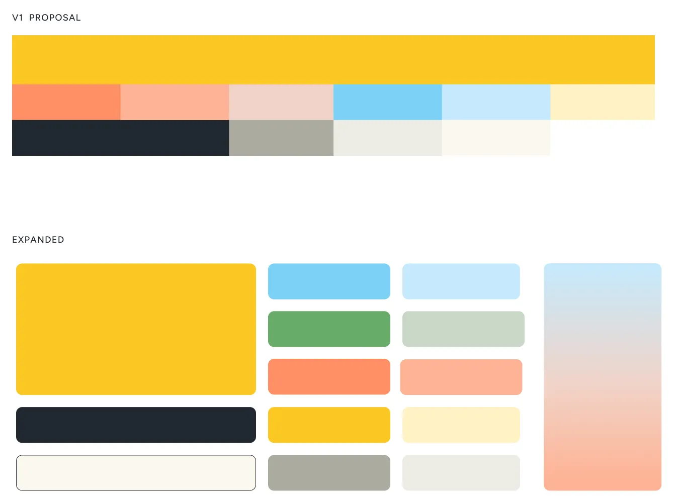
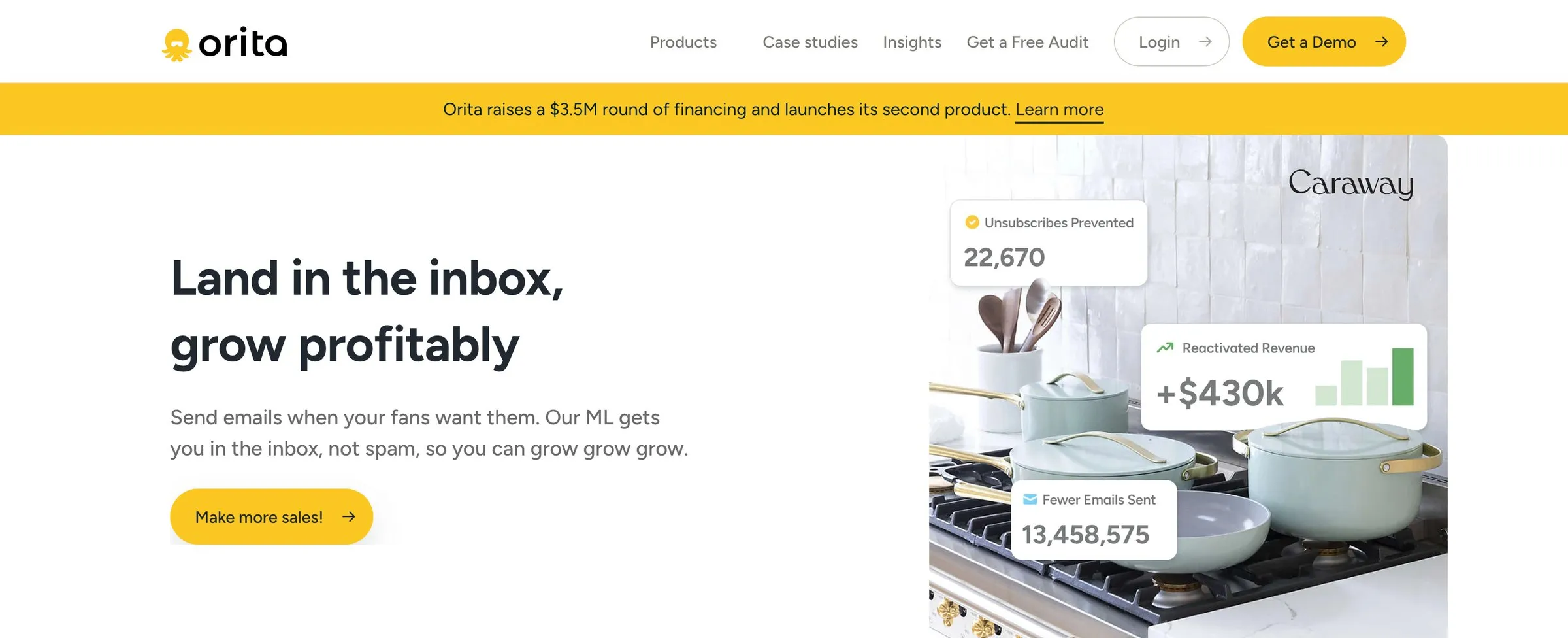
I was on product at the time, so the CEO, wanting to move fast, hired another designer for the site and the logo. Not fully satisfied with where it landed, he brought me in, after the logo, palette, type, and visual style were decided, to take about a week and clean things up, with a fifteen-minute overview of the thinking behind it. So I did what you do with a system you didn’t design and can’t re-litigate: I gave it rules. Semantic definitions for every shade, a use case for every style and pattern, master styles tied across the web app and the decks. In that first week I redesigned seven pages and drafted the team’s initial brand guidelines.
A brand that grew playful, and a team that couldn’t hold it
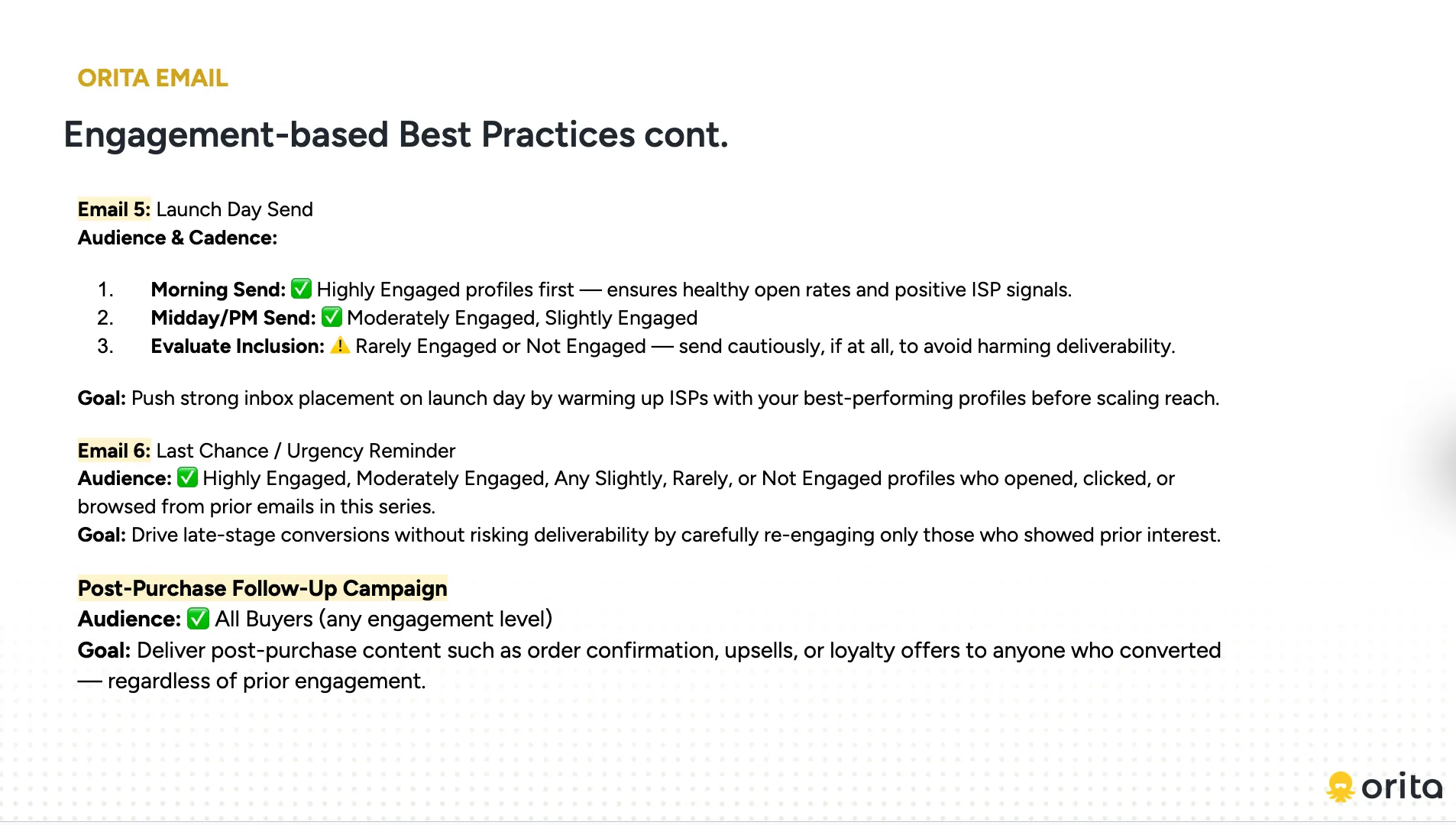
That system fed straight into the decks, where most of Orita’s brand shows up in the wild. The team was ramping up pitches and partnerships, building decks from scratch each time, and most of them ran through me for polish. So I turned the slides we reused most into a canonical set the team could pull from.
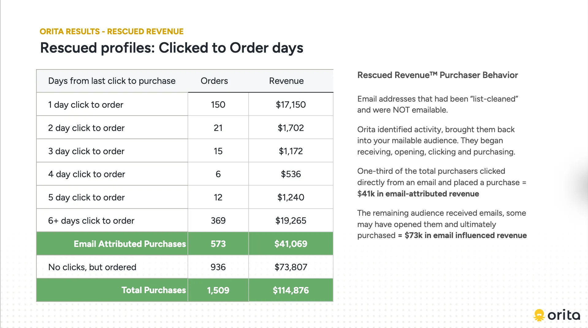
Through 2024 the direction from leadership was more personality: playful illustrations built around Atiro, the yellow octopus. I leaned into “friendly and approachable,” and the brand grew bright. The logic was reasonable: visual effort put distance between us and the WordPress-and-Google-Slides look the team had previously been living with.
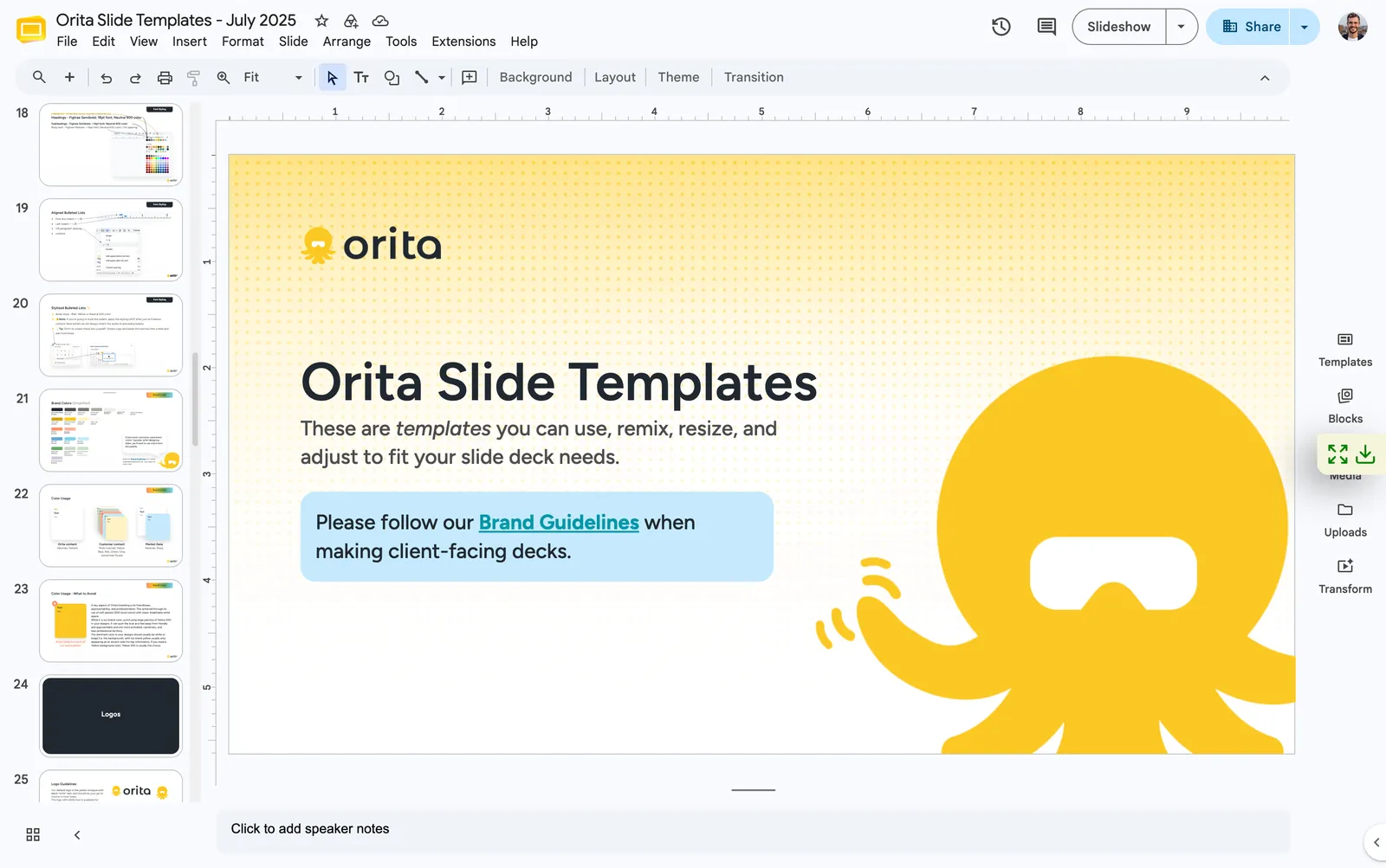
Canonical slides anchored the spine of our decks, but customer success isn’t a design team, and the bespoke slides they added looked amateur next to the rest of the deck. It risked exactly the perception the rebrand was meant to fix. So in late 2024 I specced a modular system, a wider set of templates plus a component library to copy and rearrange. By July 2025 it existed as team-wide Slide Templates with a recorded tutorial.
Listening
In the second half of 2025 I ran a research program nobody had assigned me: interviews with customers, agency partners, and the internal team, alongside a dashboard audit, a card sort, and a competitive teardown. I wanted to know how customers actually thought about Orita, what our surfaces were doing for them and failing to do, and what the product should change first. The answers came back about the brand as much as the product.
In February the co-CEOs asked me to lead an all-hands brainstorm on retention. I built the board, ran the session, and synthesized about a hundred and fifty stickies into five problem statements for leadership. The first was the one the whole team had circled without naming: customers can’t independently see or prove Orita is working, so the value story lives in manually assembled slide decks.
My own stickies on that board were the argument I’d make a month later: an agency partner keeping clients out of our dashboard because they wouldn’t understand it; a product UI that wasn’t set up to sell itself; core concepts explained nowhere but in the presentations we gave. It’s hard to build trust in something you can’t understand.
The picture that came back was consistent. Customers didn’t fully trust how Orita worked because they didn’t understand it. They weren’t sure how to use our segments alongside their own. Getting to value took longer than expected, and the product didn’t always match what the sales process had promised.
Five things converged
We marketed ourselves as fast and easy, and the research said Orita was neither for the customers living with it. The exciting yellows, the cute illustrations, the green arrows on every win: none of it matched their experience, and the customers we wanted to win expect an experience as serious as their list sizes. If you have a billion-dollar list, who would you trust with it?
The templates had helped, and drift continued, because the team didn’t have the bandwidth to learn a system with that many rules. The template library was outgrowing its users; more templates meant more scrolling. Everything routed through one designer, and some of the drift across the site, the decks, the portal, and the print pieces was mine. And the company had just put everyone on Claude, with skills newly available. Rather than keep optimizing a template system that wasn’t scaling, I started asking whether a written system could do the work better than a template library ever would.
March 2026The audit, and the argument
I audited every surface we had, to find the common failures and to ask what a more intentional system would look like: one that met the company’s goals, fit the traits, matched what customers actually experienced, and could be reproduced by people who aren’t designers. The argument I took to leadership was that the brand and the product were selling different things: the brand was bright and playful, the product was sold on expert-led science. They agreed to publish in April.
The operating principle, in the words I used with the team: design is the stage, content is the performer. The first thing a customer reads should be the content, not the system holding it. Personality moved from the visuals into the copy. The rules under it are the ones I argued to the team, slide by slide.
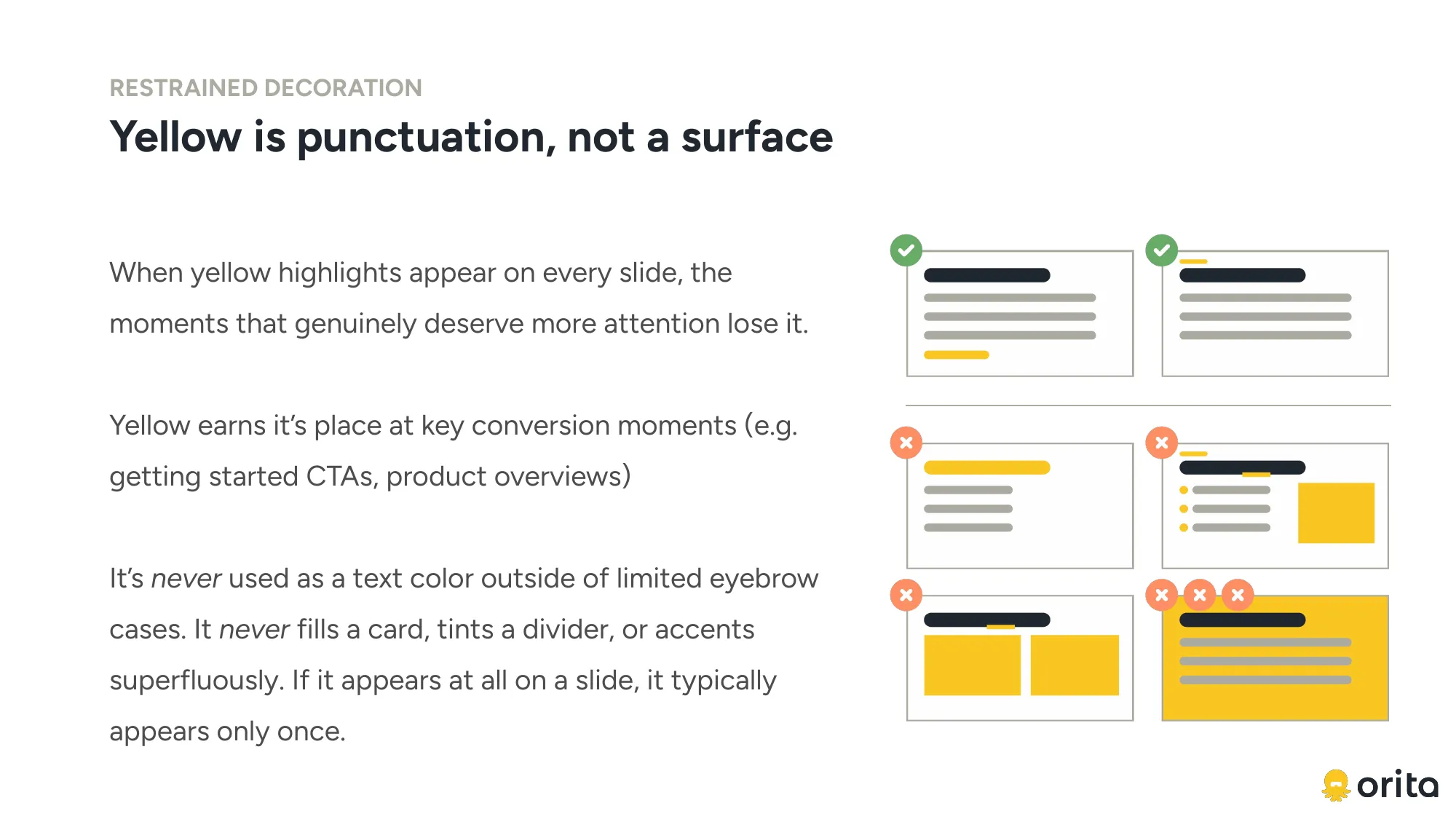
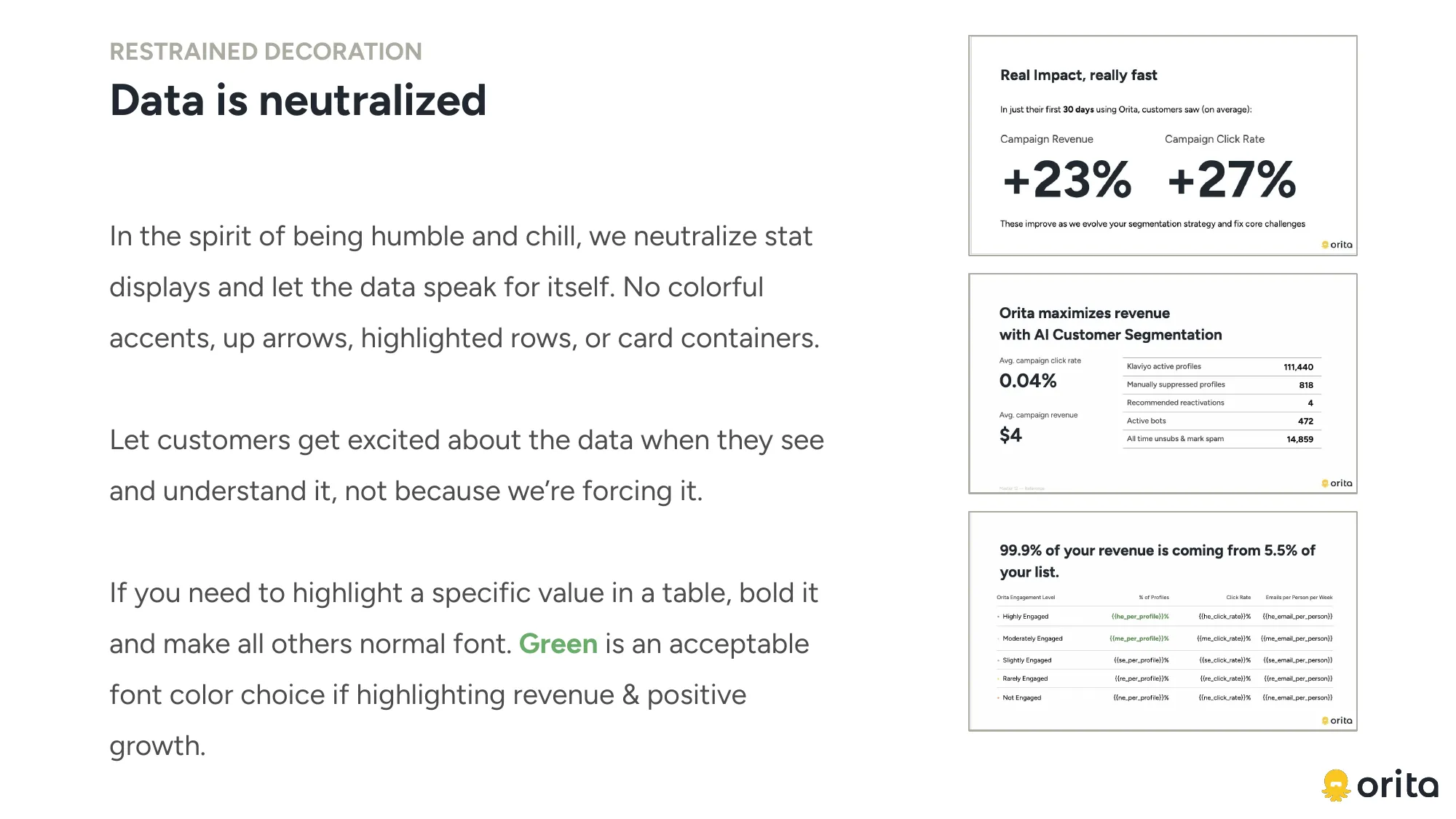
Color variation comes from the customer’s own content, so the per-customer pastels retired. Illustration went true-to-life: real UI, real data, clean diagrams. Four visual registers, marketing, teaching, conversion, celebration, so playfulness has a sanctioned home and never leaks into the product story.
April–May 2026The homepage first
I started with the homepage: the gateway to the product and the brand, and the natural foundation for every other surface. The page I was replacing was a product showcase, not the calm, sharp partner the personality described. The redesign restructured it as a diagnosis: what it is, proof it works, how it works, then channels. Its centerpiece is a How It Works section that shows the actual data flow and the model, built as an animation, which became the brand’s illustrative reference point.

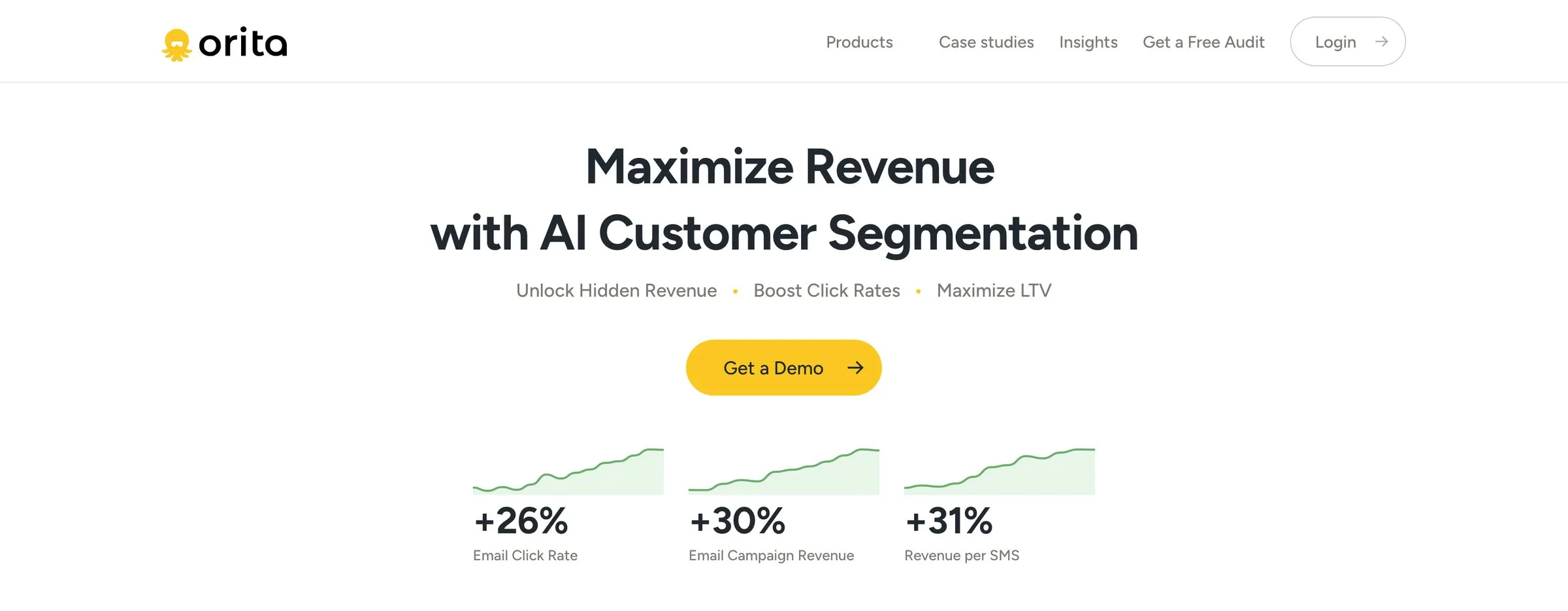
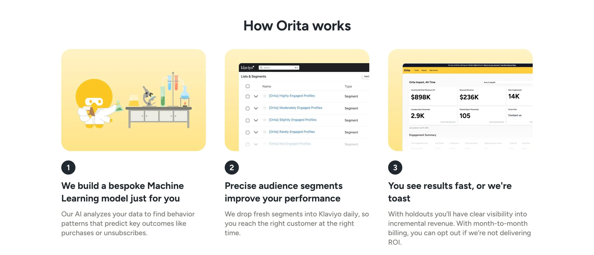
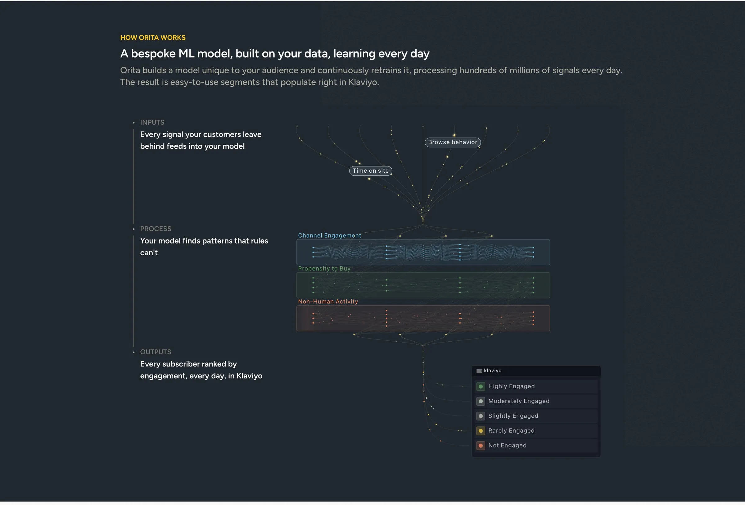
Two things I didn’t solve: the cool greys against the warmer off-white ground, deferred as a larger effort, and the co-CEO’s objection that the system was a suit with no pocket squares, which got a grace period rather than a design answer. The refresh shipped in May, and I carried its foundations across the rest of orita.ai and into the blog, where each header illustration is now a diagram of the mechanism the post explains.
Spring 2026The slides, on the same principles
The decks had their own diagnosis: the templates weren’t being used because the team makes dense, multi-topic slides that templates can’t hold, and every from-scratch deck was a chance for the brand to drift, because the team was making styling decisions they shouldn’t have had to make.
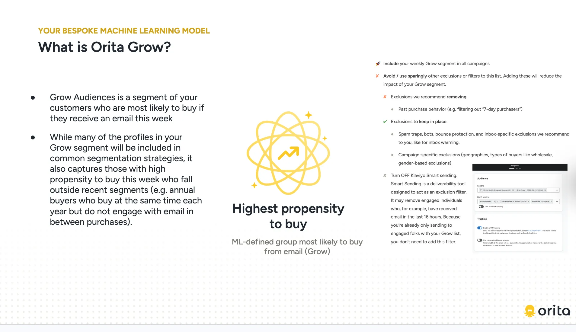
So I simplified the entire system, to cut the number of decorative decisions anyone has to make. One decision was a deliberate walk-back: the original guidelines had banned Regular, and I brought it back because Bold and Regular are a single Cmd+B apart and customer success was losing time in the style dropdown. One concept per slide, with the dense version pushed to the appendix as the leave-behind. Some of it I lost: the paper texture I’d introduced wasn’t what I’d hoped for, and I switched to white.
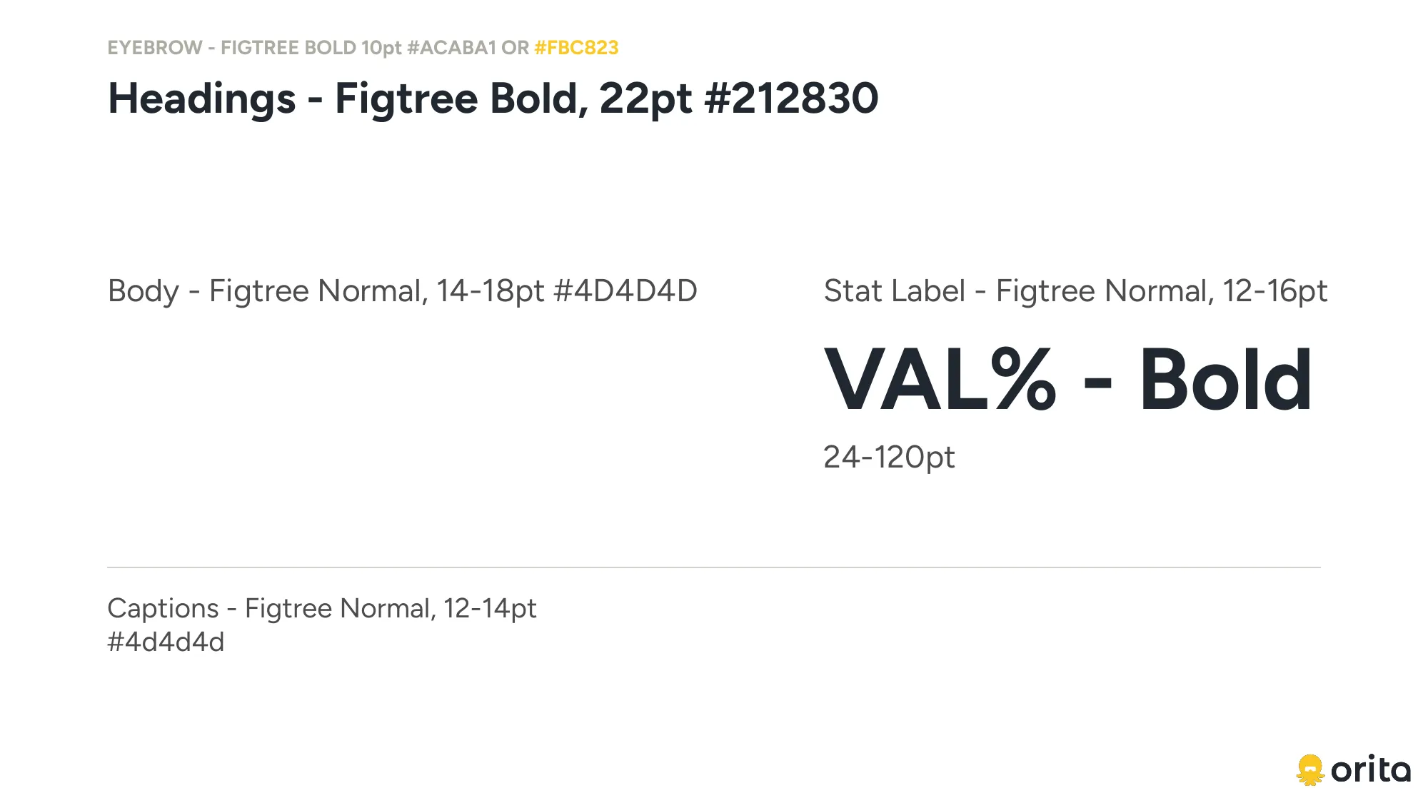
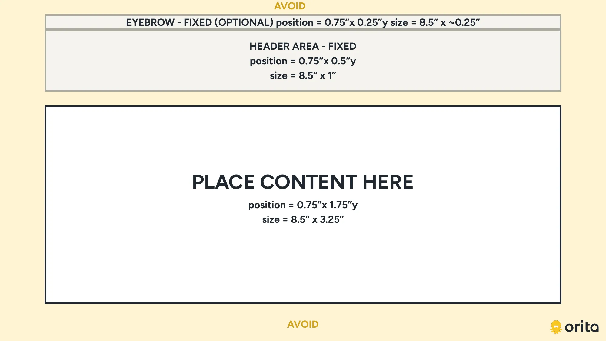
The rules are checkable. A validator treats Semibold, Medium, Light, and Italic as hard errors, flags label-style headings, and warns at three or more content zones or about 75 body words. Writing the rules so a script can check them is what made them hold.
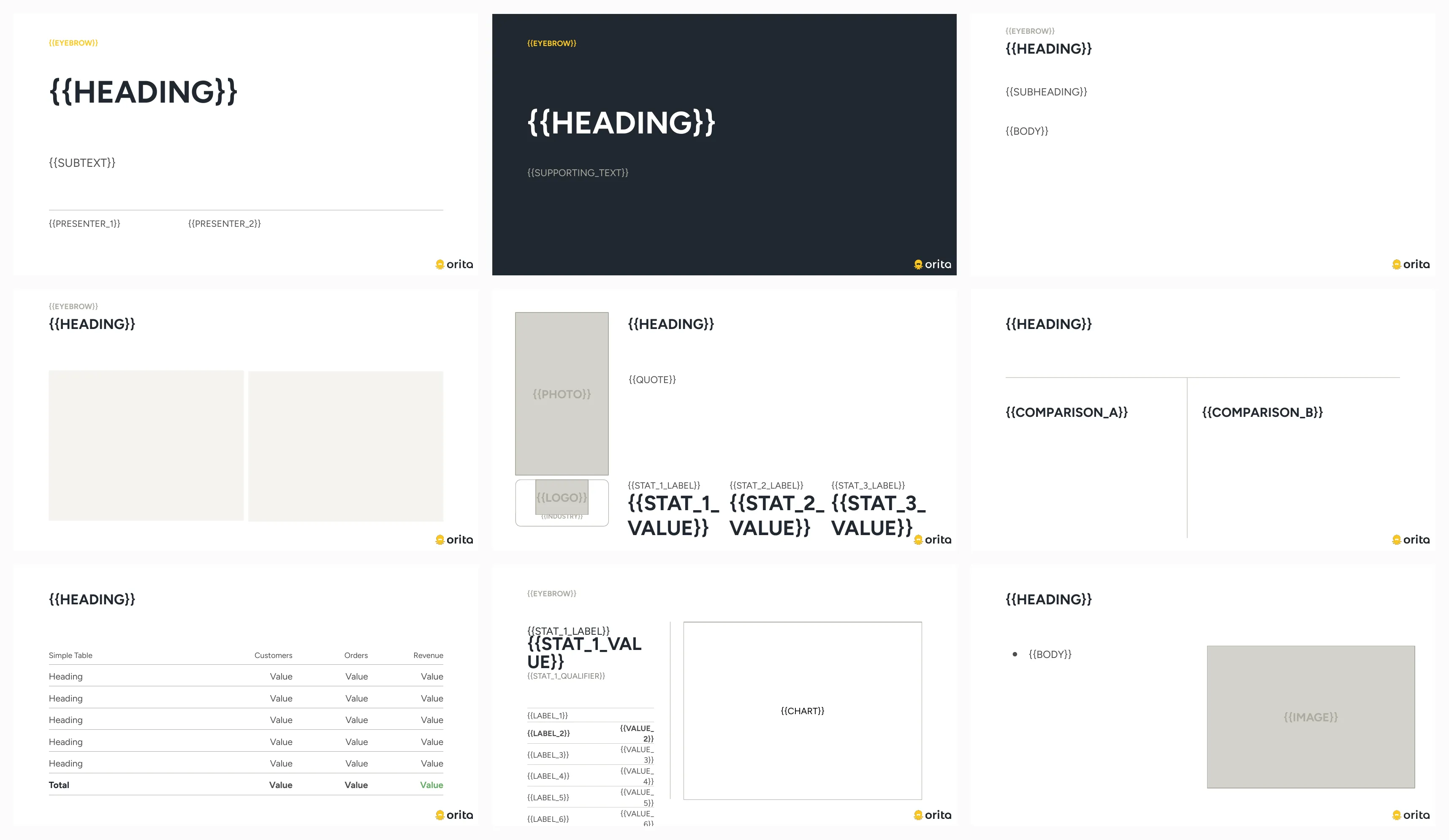
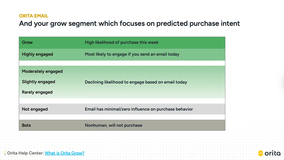
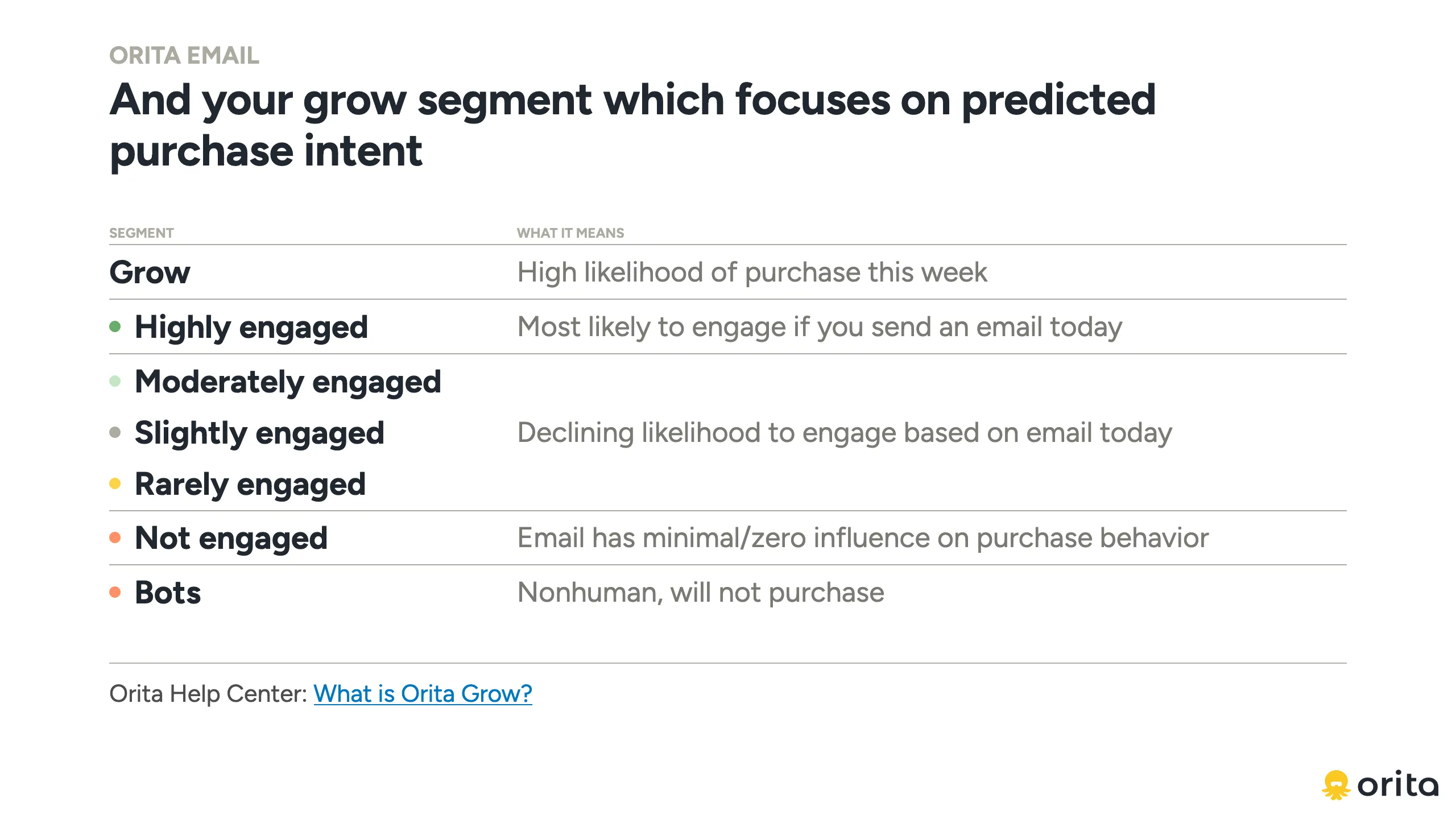
Then I designed for the tool as well as the team. I used the audit to find the layouts the team actually reaches for and designed those as canonical templates, simplified and reserved, the identity carried by hierarchy rather than decoration. Two master decks came out of it, canonical slides that get cloned and templates that get filled, which greatly simplified the logic anything downstream had to follow. Fewer decisions means both the team and the tool make fewer mistakes.
Teaching a machine the brand
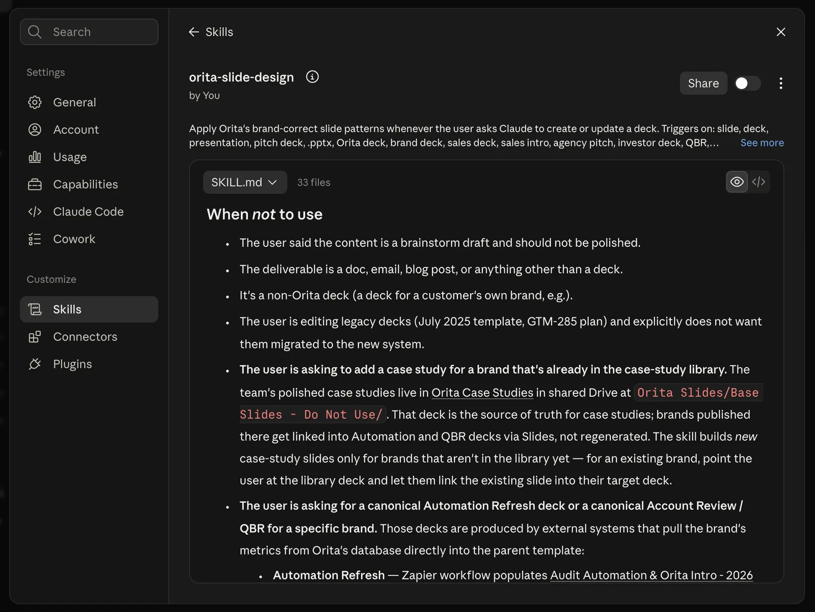
Then I wrote the taste down. I built orita-slide-design, a Claude skill that generates native, on-brand Google Slides from the canonical decks and templates, used it to rebuild our key decks, and put it through nineteen rounds in five weeks: generate mock decks from real customer-success use cases, critique, tighten the rules, generate again. A generated slide reached customer-facing use three days after v0.5.
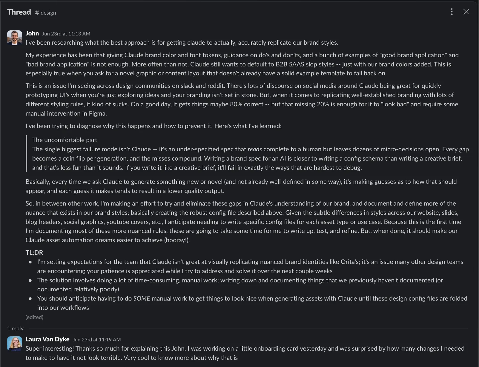
What I learned, I wrote to the team as I released it: brand tokens, do’s and don’ts, and a pile of good and bad examples weren’t enough, and the biggest failure mode wasn’t the model. So I set expectations: the tool wasn’t there yet, other design teams were hitting the same wall, and the fix was slow documentation of rules we’d never written down.
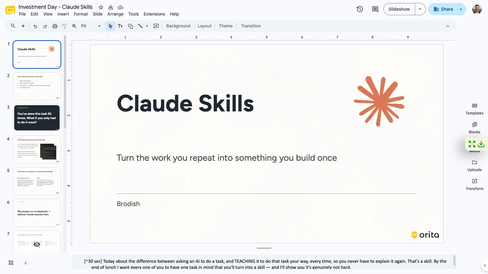
A few weeks in, the team voted a skills session with me the top investment-day topic, and I ran it with the live demo built on a salesperson’s real prospect-research checklist. Same day, a teammate built her own skill; within a week a company-wide voice-of-customer skill existed. The skill itself was an okay answer to the branding problem and not a great one for the team’s range of decks: ask it for a layout it didn’t have and it found its way back to one it did.
The system that retired the skill
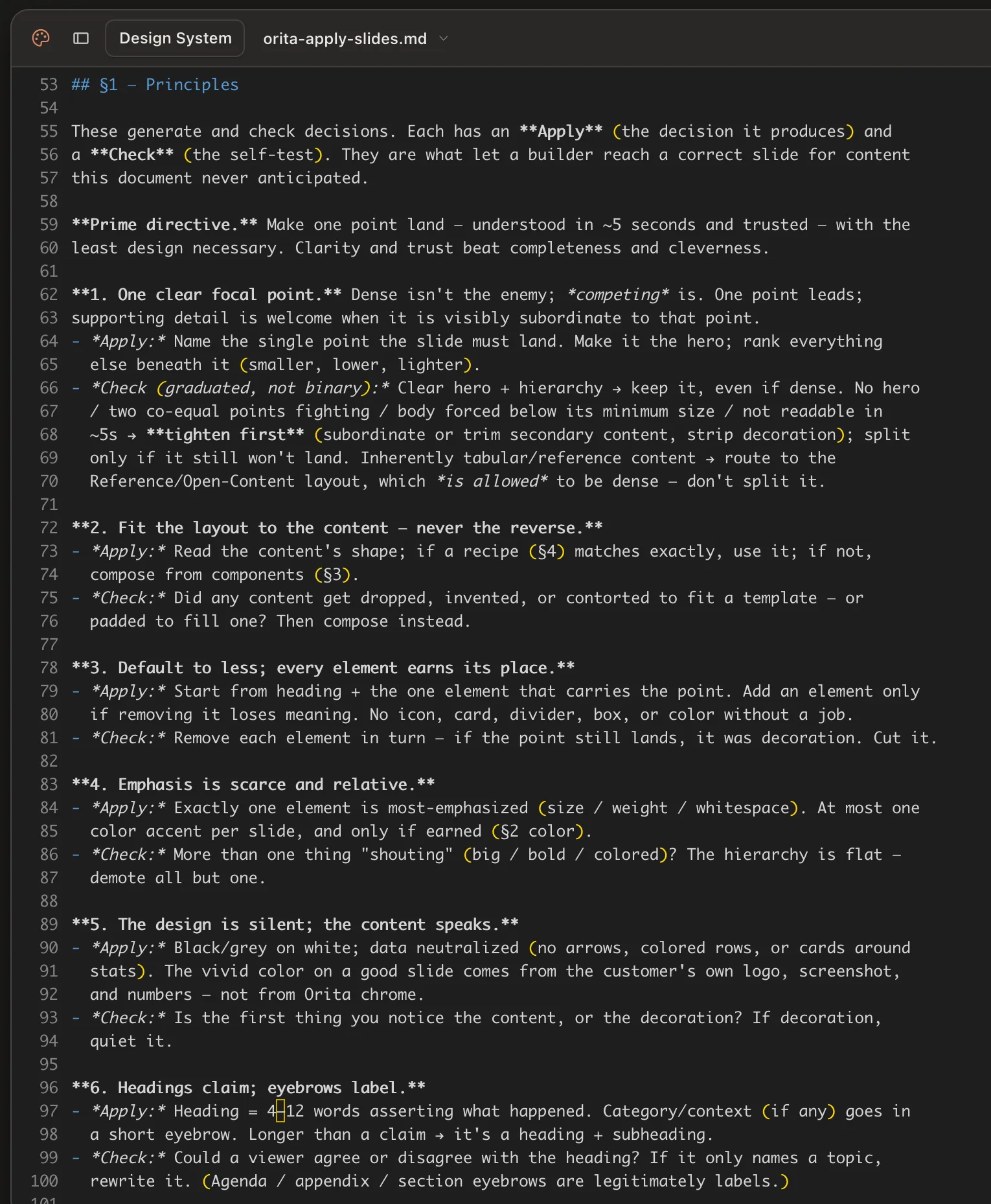
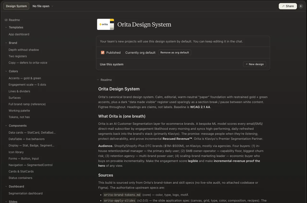
By then I’d concluded that training a model to produce on-brand work is writing instructions complete enough that a person with no context could execute the design, structured so a machine can follow them. So I ran a second audit, this time on the refreshed surfaces, and codified rules for every style, pattern, and component, designed for generative output from the start: principles the tool follows even when no template covers the request, and as much about when not to use something as when to, because the gaps are where drift lives. The brand became a parent tokens config plus an org-default Claude Design system, with coded layers alongside it, and the brand guidelines moved in; it’s where the brand lives now, because it’s where the team can reach it. Slide output lands roughly 80% of the way to the ceiling I could see, by my own five-criterion audit and as a conservative estimate; the remaining fifth is refinement I’d still make by eye, not output coming back off-brand.
When the system outperformed the skill, I retired the skill, on August 4, 2026. The goal was never the tool. It was a centralized source for the brand, reachable by anyone at Orita without me.
What I claim
The numbers that would settle it: the share of decks that ship without a designer touching them, correction time per deck before and after the system, and how many people generate something in their first month against how many come back.
Documented rows have a dated artifact I can produce on request. Recollection is mine, undocumented.
The loop
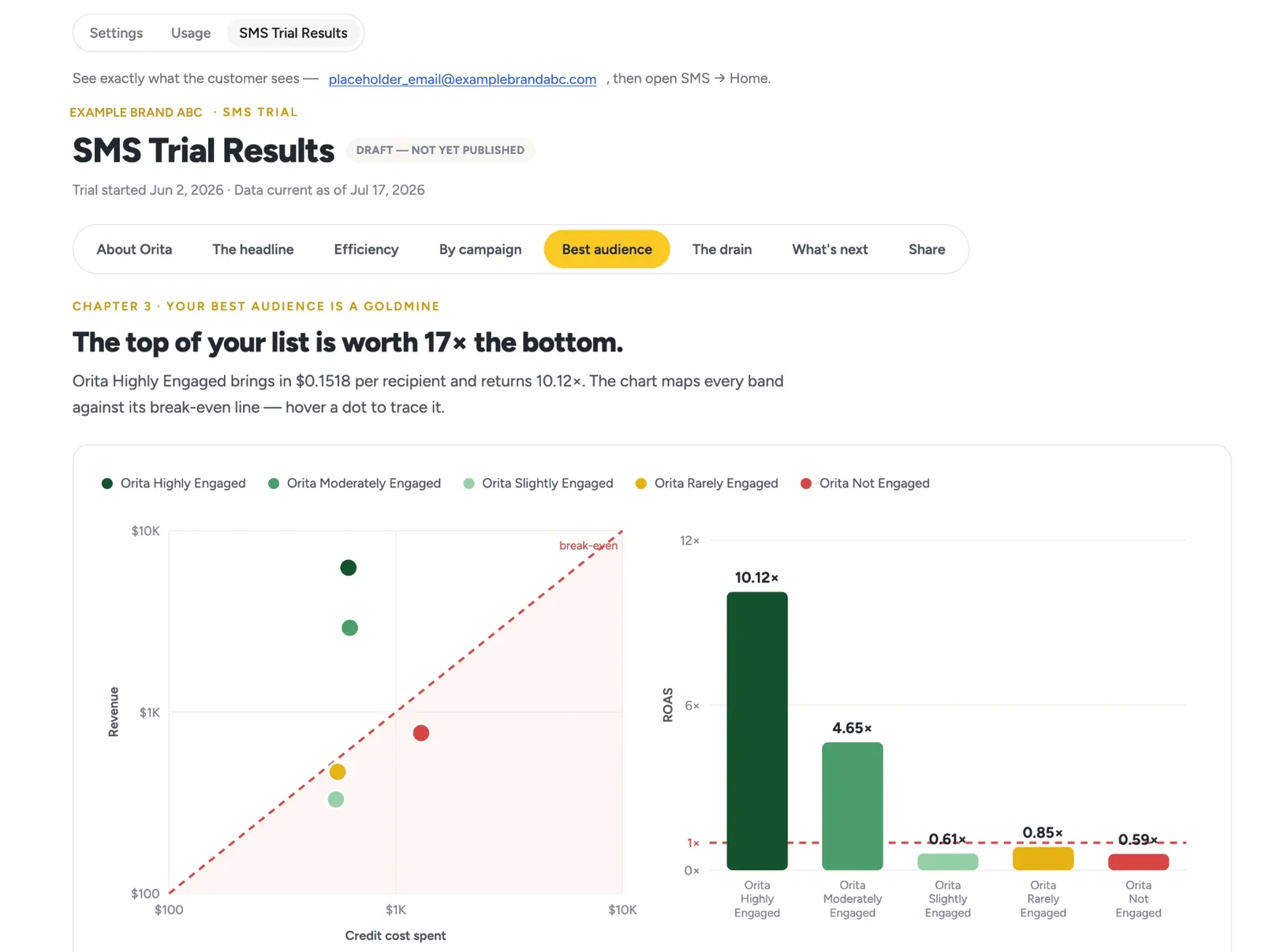
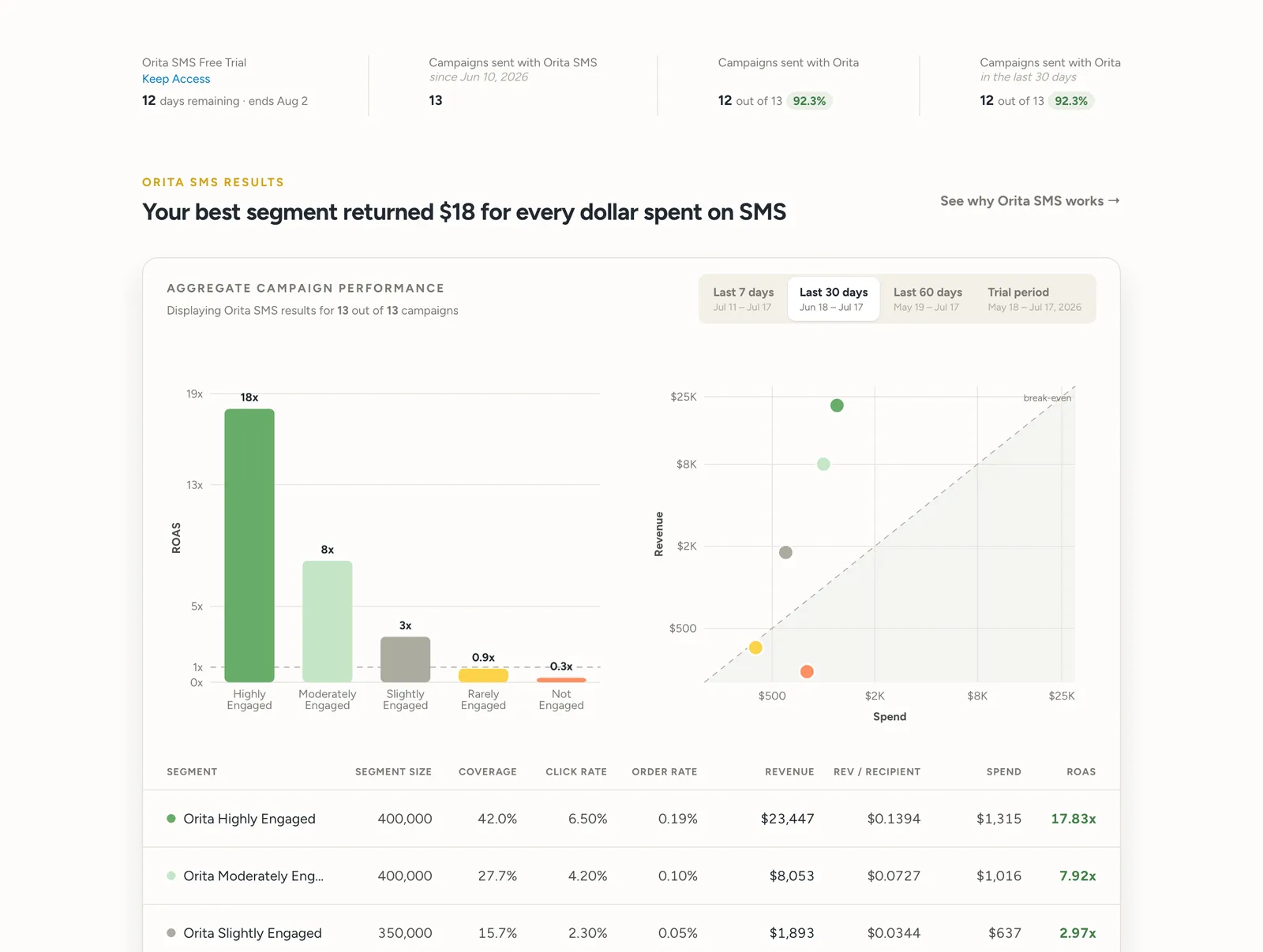
In July 2026 an engineer stood up a working draft of a customer-facing trial-results page in a few days: fast, and rough the way a first pass is. I duplicated it into the design system and passed it through, spent a few hours refining the output by hand, then fed the refinements back into the system. I synthesized what customer success, customers, and leadership each needed; the engineer pulled pieces of it into his build. Rough draft to production-ready in under a week, the team’s own recap, and the infrastructure got better in the same pass.
Working without me
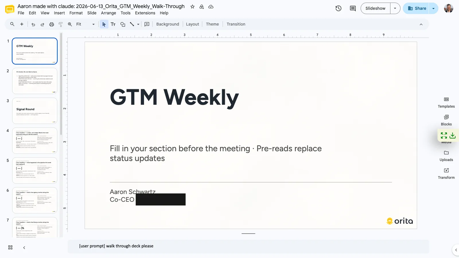
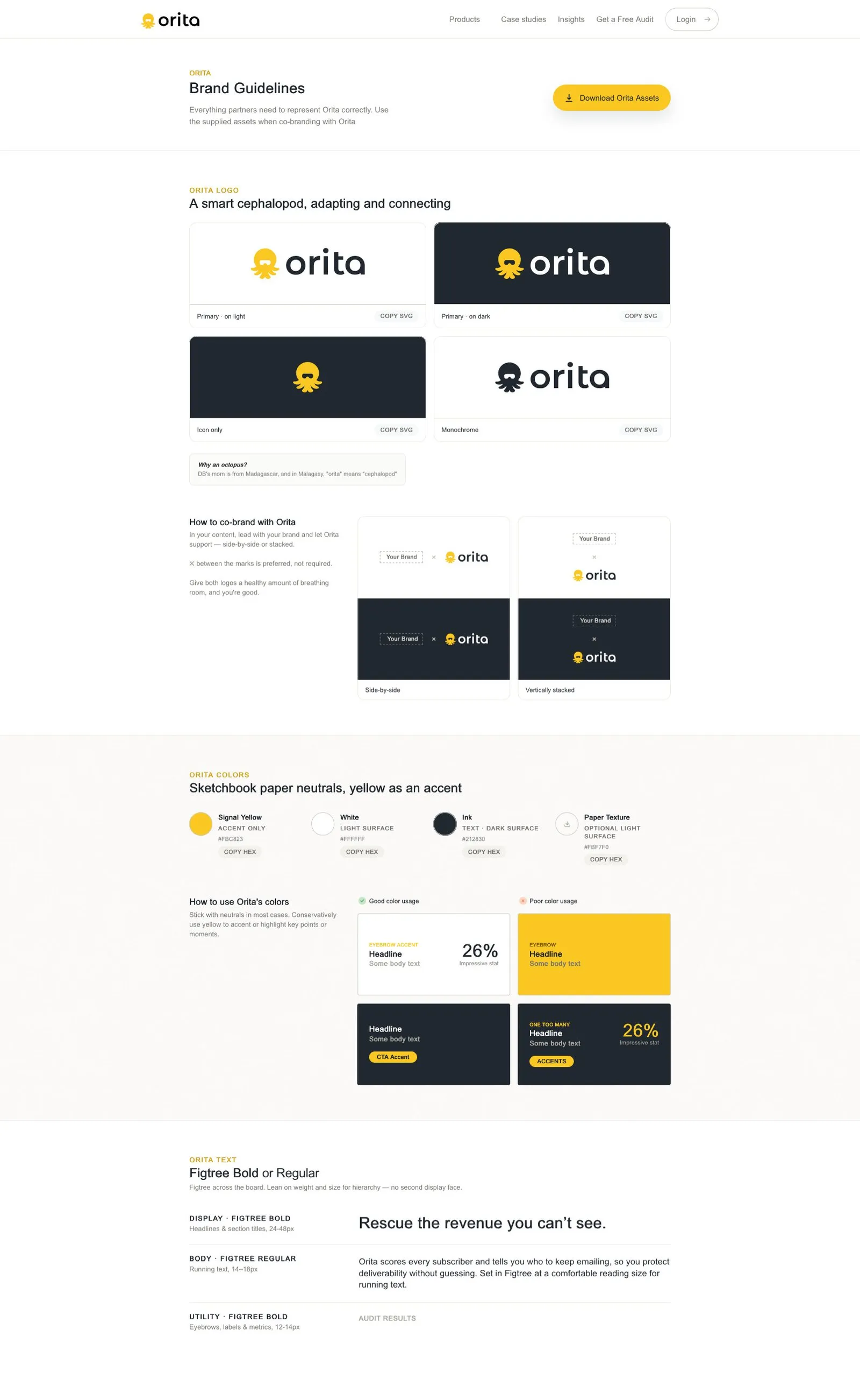
The co-CEO generated his own on-brand deck; the file is literally named “Aaron made with claude.” Seven decks from five uploaders landed in the shared folder in its first six weeks. The marketing lead built a LinkedIn banner in the system. The brand became a public product: orita.ai/brand, a self-serve co-branding portal for partners and agencies. And at an August all-hands, unprompted, a teammate said the system’s output was “better than I could have come up with on my own, and it fit perfectly.”
What I claim, and what I don’t
Mine — the 2024 positioning workshop·systematizing the 2024 identity·the late-2025 research and the retention synthesis·the 2026 refresh argument, the homepage, and every page of orita.ai·the slide system, templates, and skill·the org-default design system·orita.ai/brand·the trial-results page design pass
Theirs — the logo and 2024 visual direction (two outside designers)·the five traits, written together in the workshop·the automation decks’ variable mechanism (an engineer) and copy (the co-CEO and customer success)·every deck the team generates inside the system·the skills teammates built after the workshop
Whether the system reduced the design work a deck takes, or kept the people who tried it, I never measured, and nothing I have access to says whether the refresh moved traffic or leads. The numbers that would settle the first: the share of decks that ship without a designer touching them, correction time per deck before and after, and how many people generate something in their first month against how many come back. Seven decks from five uploaders is the closest thing I have, and it counts one folder.
Reflection
For years my job was encoding other experts’ judgment into products that work when the expert isn’t in the room. This time the expert was me, and the hard parts weren’t the ones I expected. The research had to overrule my own pages; restraint is an easy principle to state and a harder one to apply to work with your name on it. And the judgment didn’t scale when I taught it or templated it. It scaled when I wrote it down at the level of detail a machine needs, which turned out to be the level a busy teammate needs too. That’s the job now: fewer decisions for everyone else, so the decisions left are the ones only a designer can make.